Category:
UX/UI Designer
Client:
MUVZ U


Traffic Safety Store needed an easily updated e-commerce template for all their child sites so they can corner niche markets.
Overview
Traffic Safety Store operates multiple child sites, such as parkingblocks.com and stopsigns.com, so they can target specific niches within the safety industry through SEO marketing. However, the design of these sites were hilariously inconsistent and outdated. There was a charm, sure, but it undermined brand credibility, which is crucial to Traffic Safety Store.
They aim to cultivate a feeling of safety when their customers purchase products from them.
The Problem
Setting aside the pixelated photos and veneer that vibrated shaddy unprofessionalism, Google was knocking these sites due to lack of optimization. Since our marketing relies heavily on SEO to approach smaller bases, this was causing a severe dent in our sales.
Still, our CEO had a hard time justifying taking our small tech team's time to individually design and build out each new website. A medium-cap company has limited resources, and the engineers had a 5K long list of other projects they needed to do for the parent site.
My Proposal
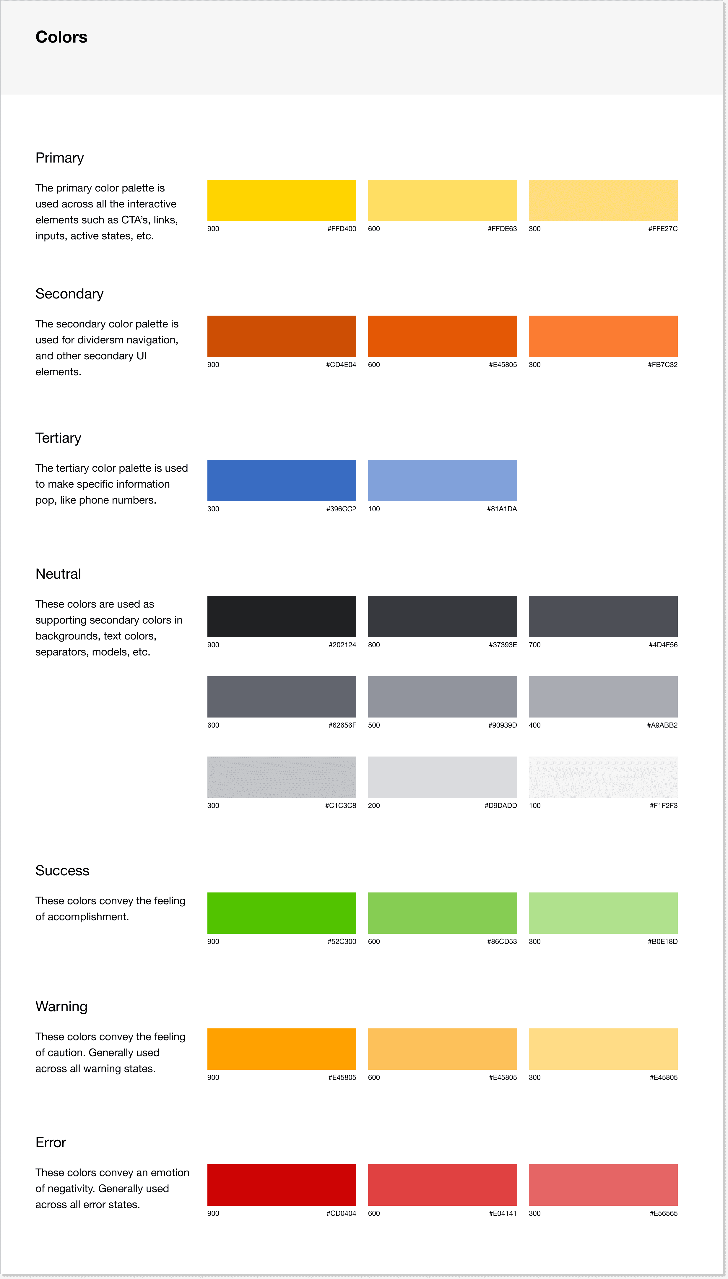
I proposed the idea of designing a custom e-commerce template specific to Traffic Safety Store's needs. On the design end, I would accomplish this by creating a design system through Figma's robust tools. Our engineers would then take the classes and structure through dev tools and create libraries for easy customization. Like having a light theme and a dark theme, they would be able to pull the template and change the colors and graphics specific to that child's branding.
Once the templates and libraries were created, we hoped to cut development time from 4 months to less than 3 weeks, with a bulk of that time allocated for the C-Suite to decide what exact products and SEO copy they want to put on each site.
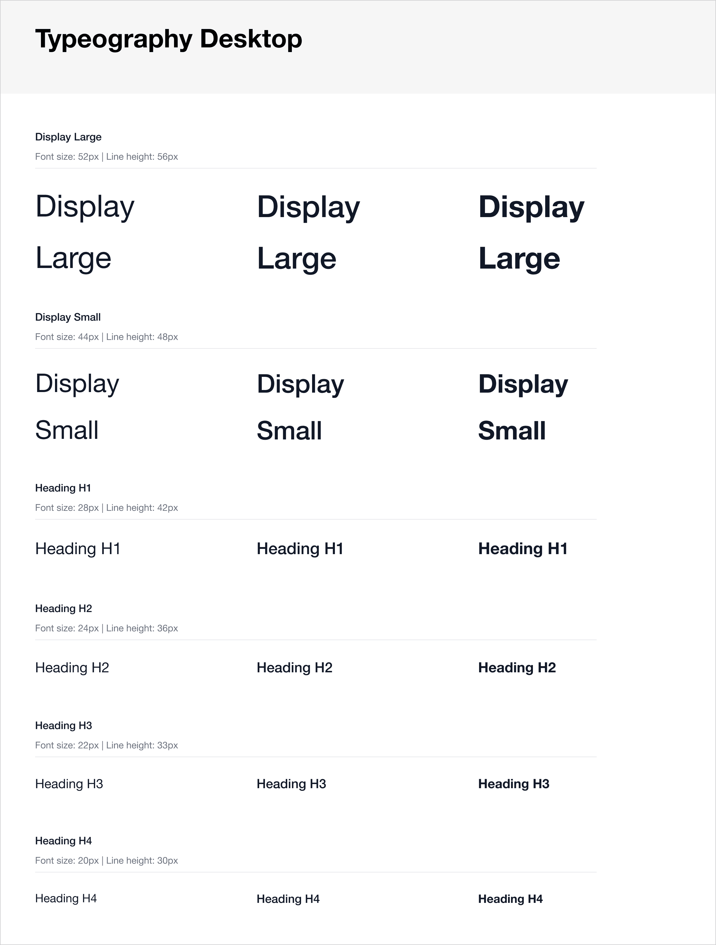
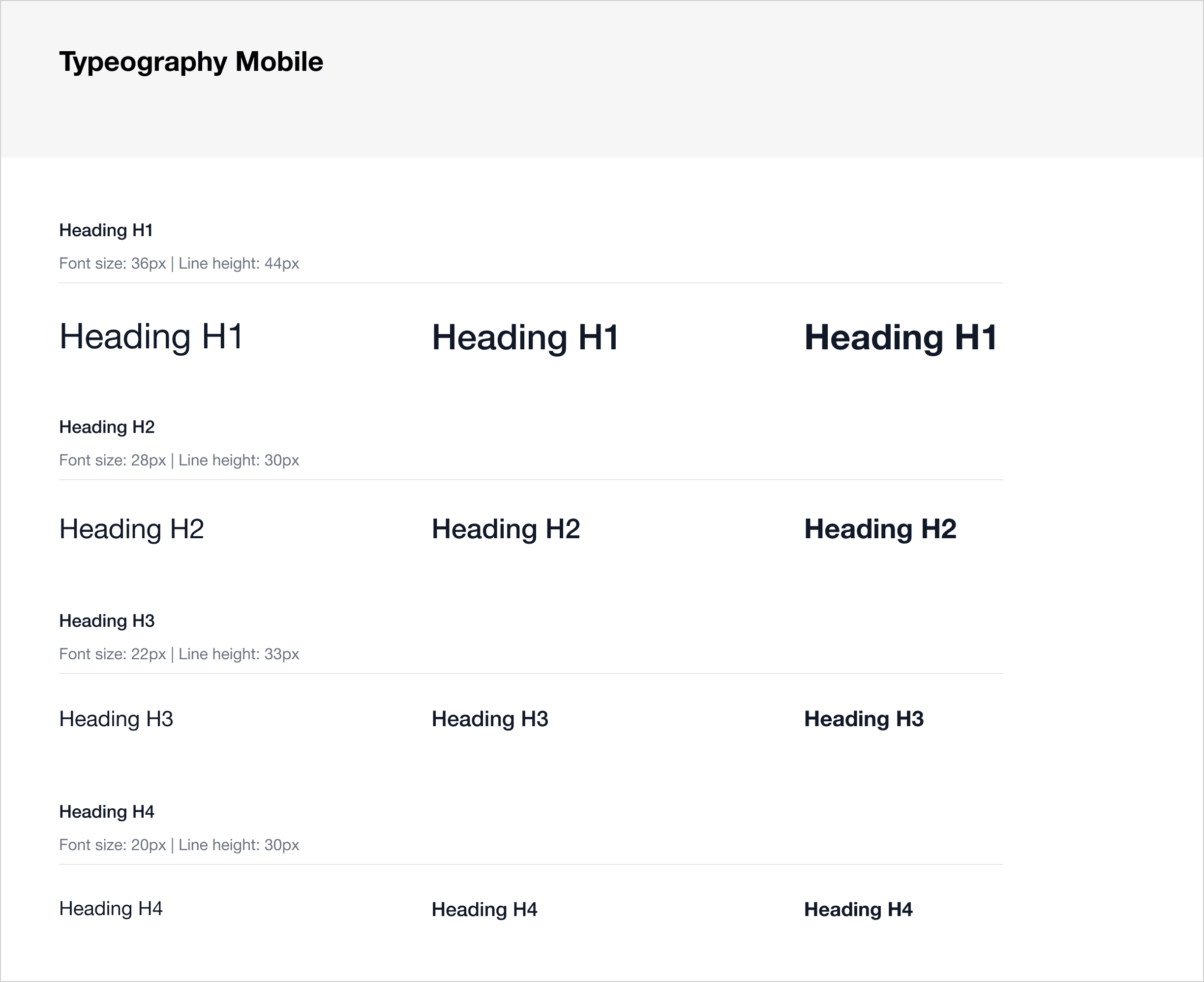
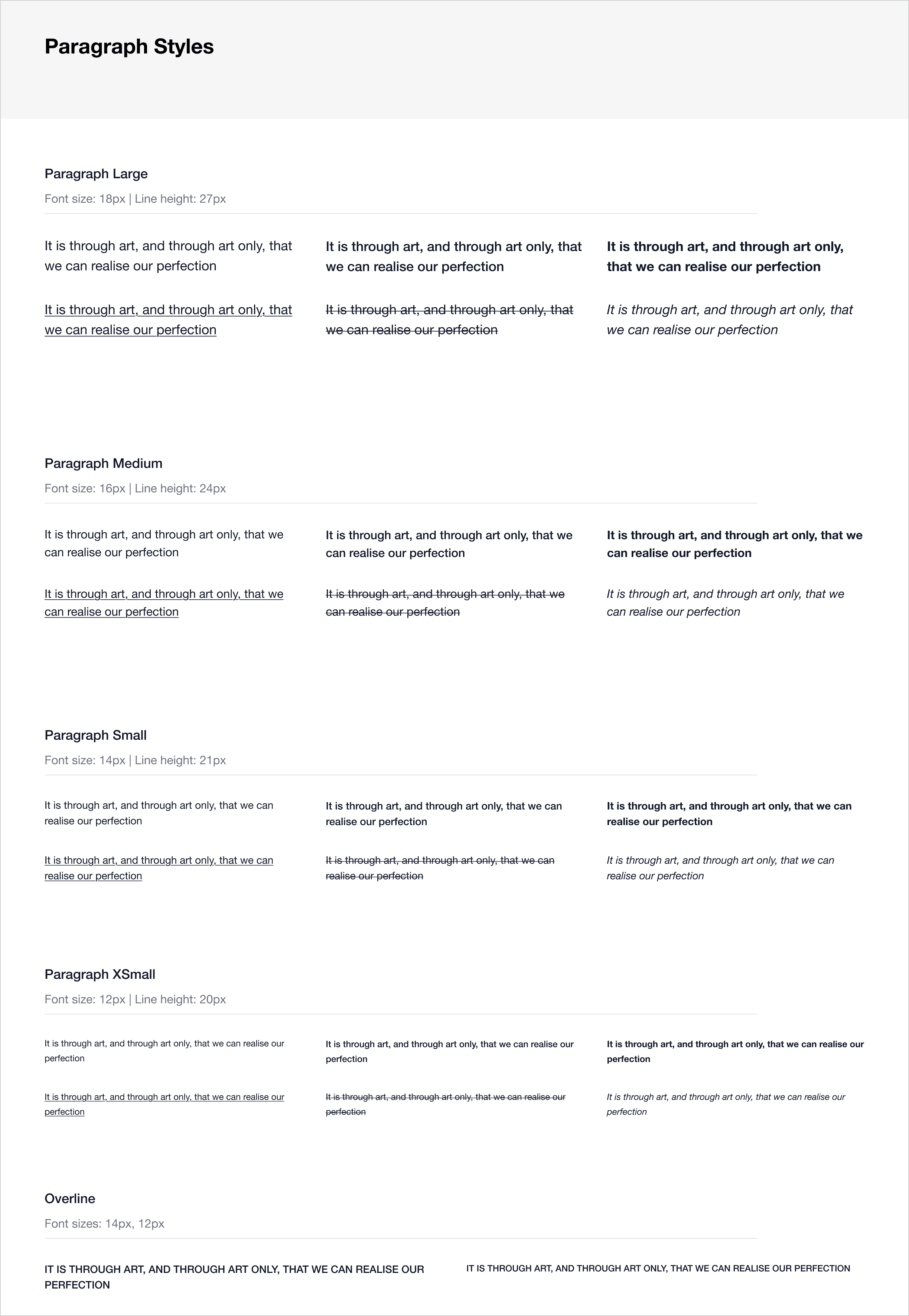
UX Guided by Previous Research Conducted
To achieve consistency and scalability, we drew from data we had from years of A/B tests, user interviews and research conducted through the parent site trafficsafetystore.com.
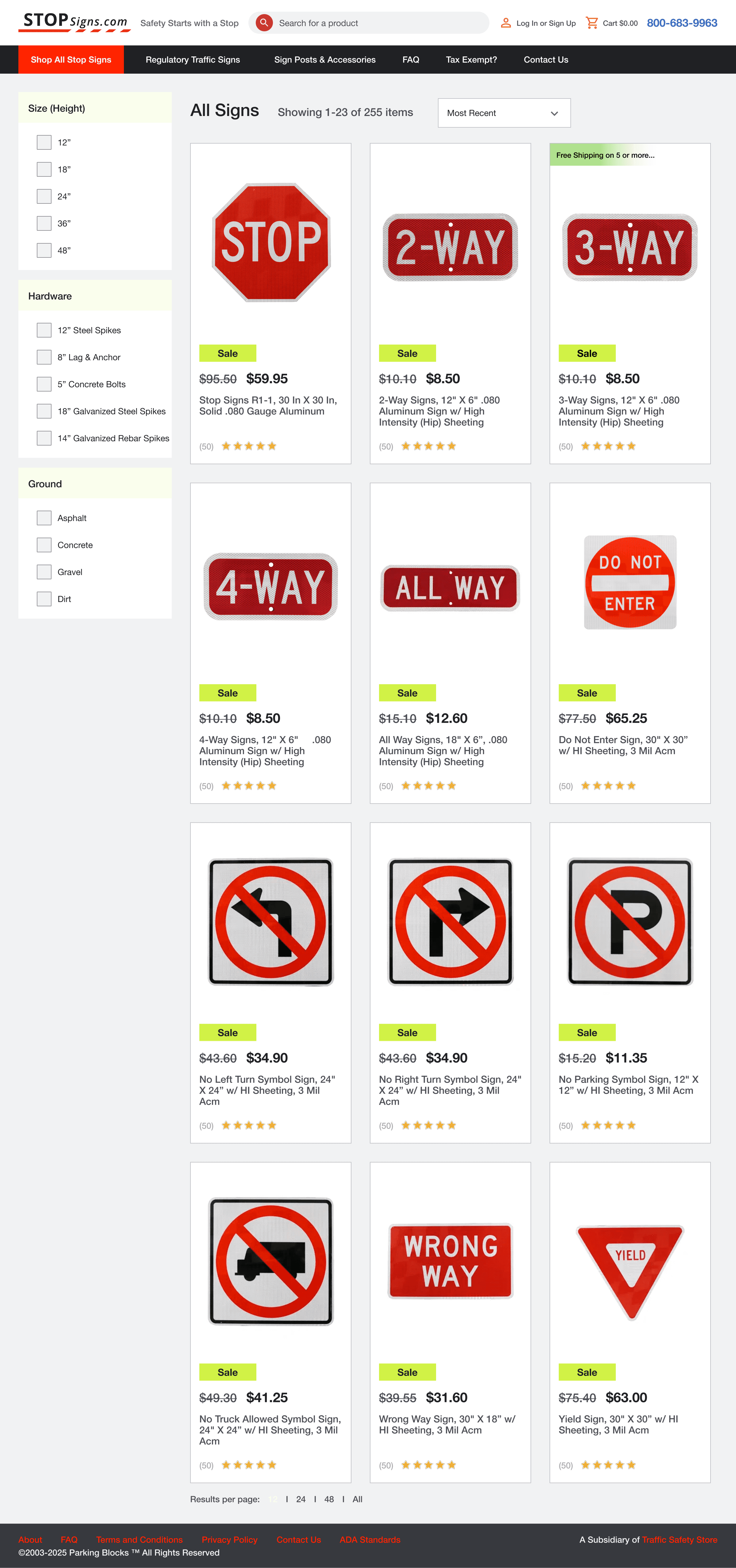
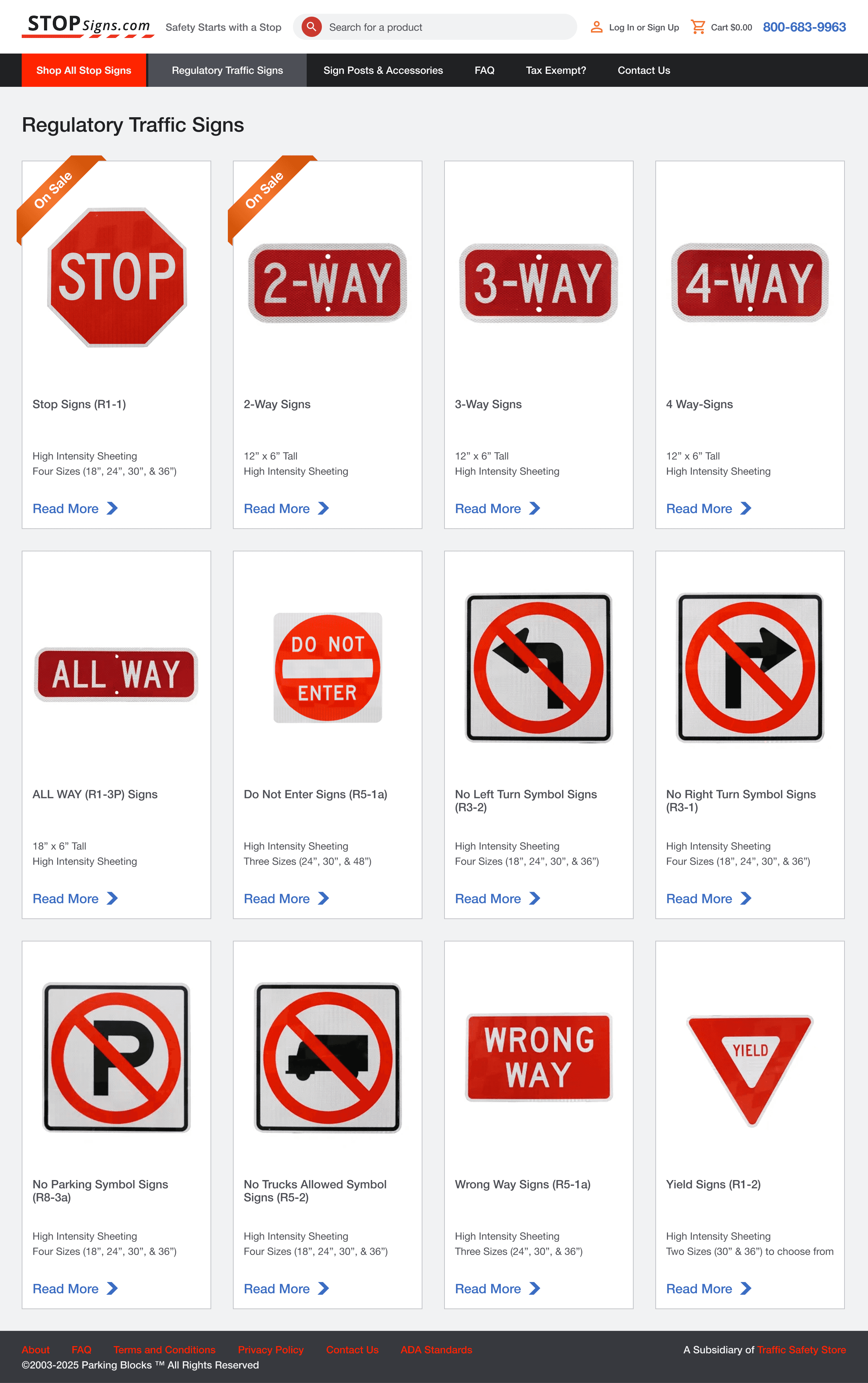
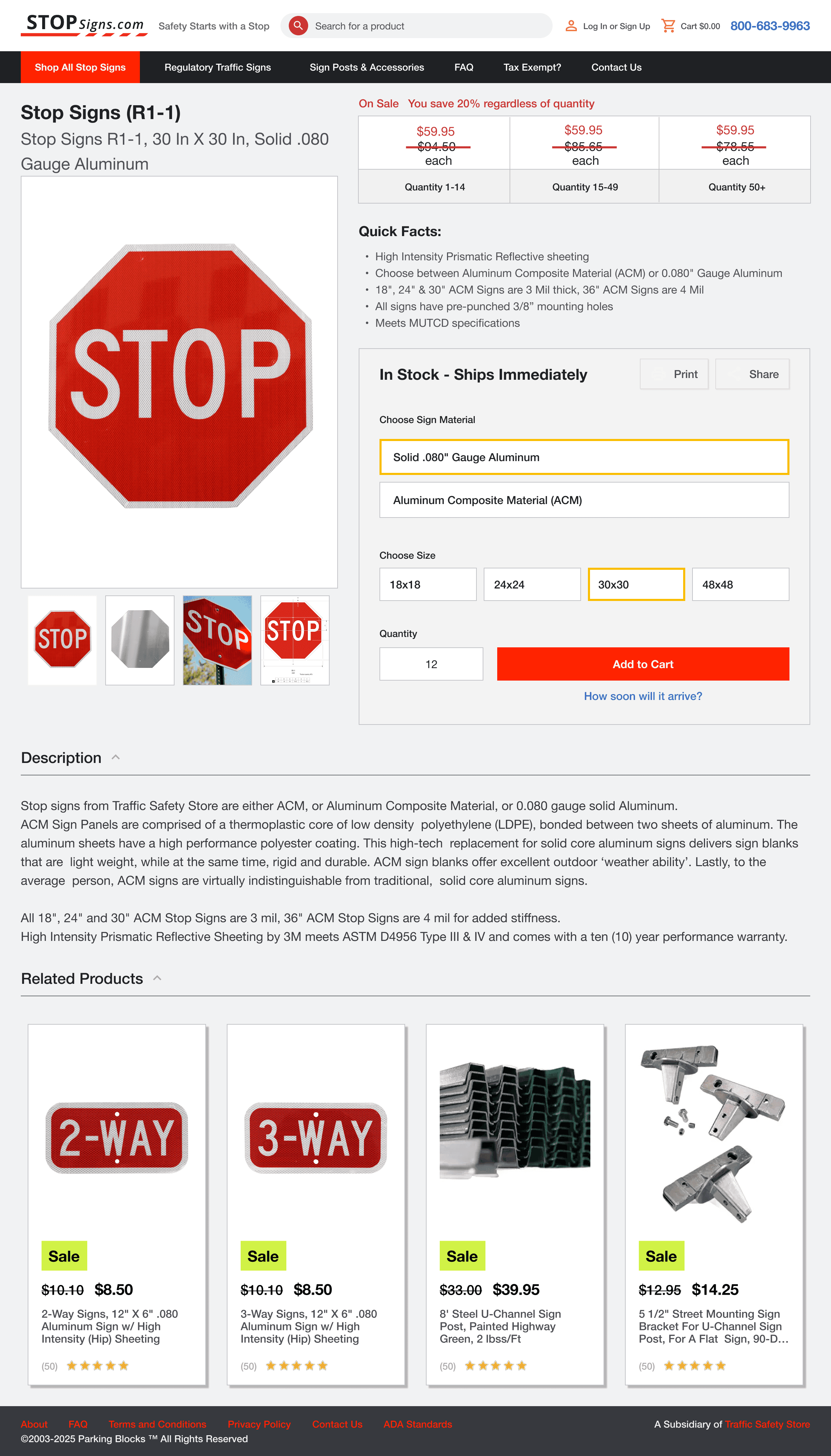
We know our customers like product cards, have a negativity toward flashy animations, and an unshakeable love for price grids. These, among many other insights, made it easy to create reusable components, color systems, and typography systems that would create a cohesive visual identity across all child brands.
With this approach, we hoped that new customers would have a better experience overall, while returning customers would find the new site familiar yet significantly improved.
Finally, to address the poor-quality visuals, sometimes you have to do what is outside of your description. Without a photographer, I personally retook product photos, ensuring every item looked professional and high-resolution.
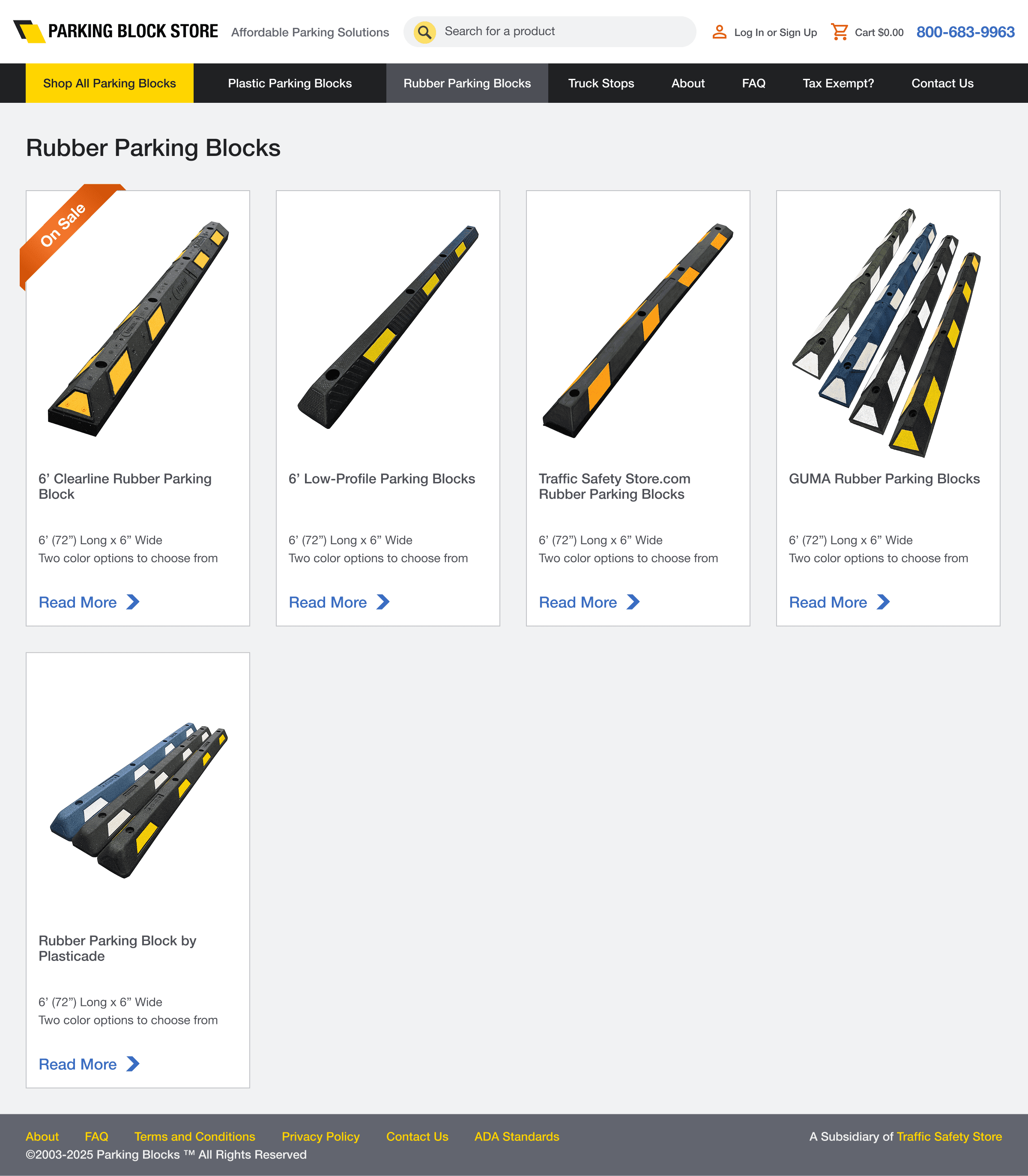
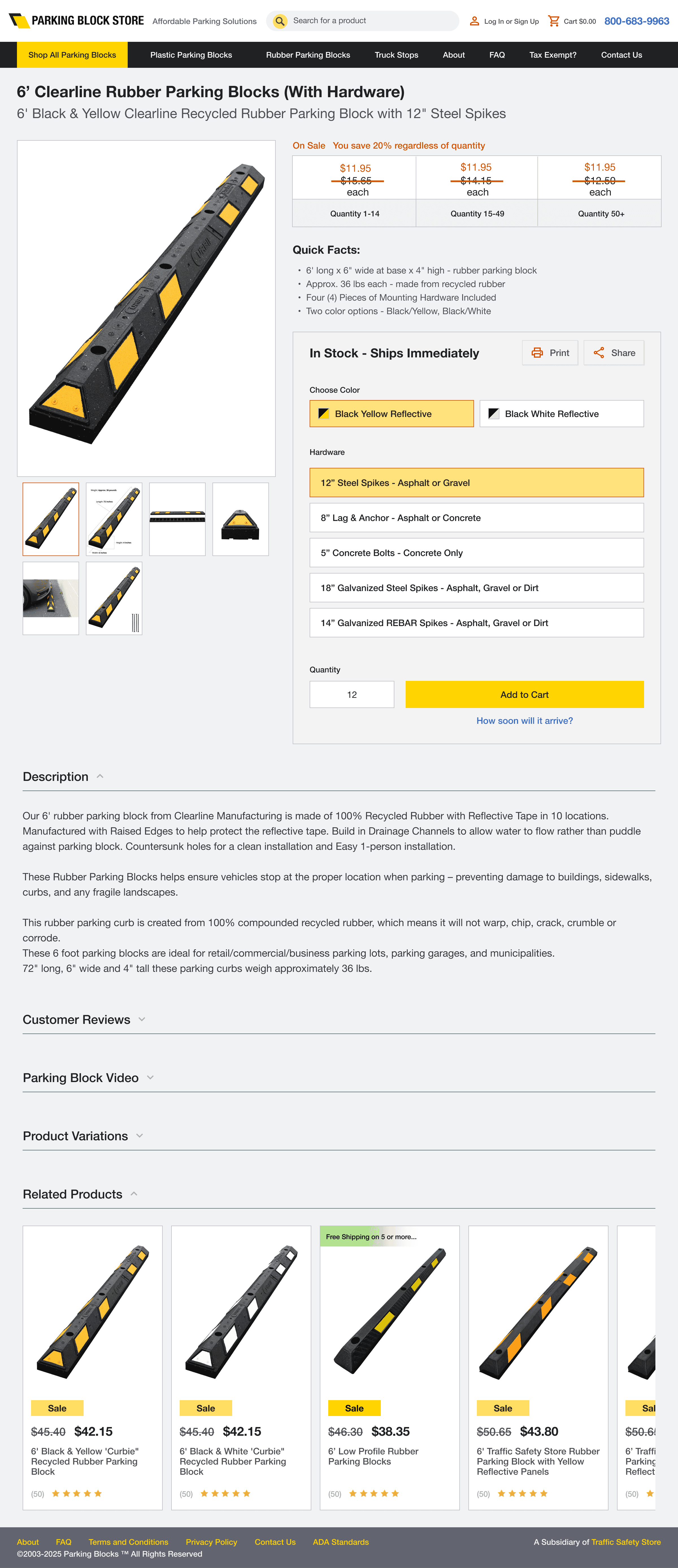
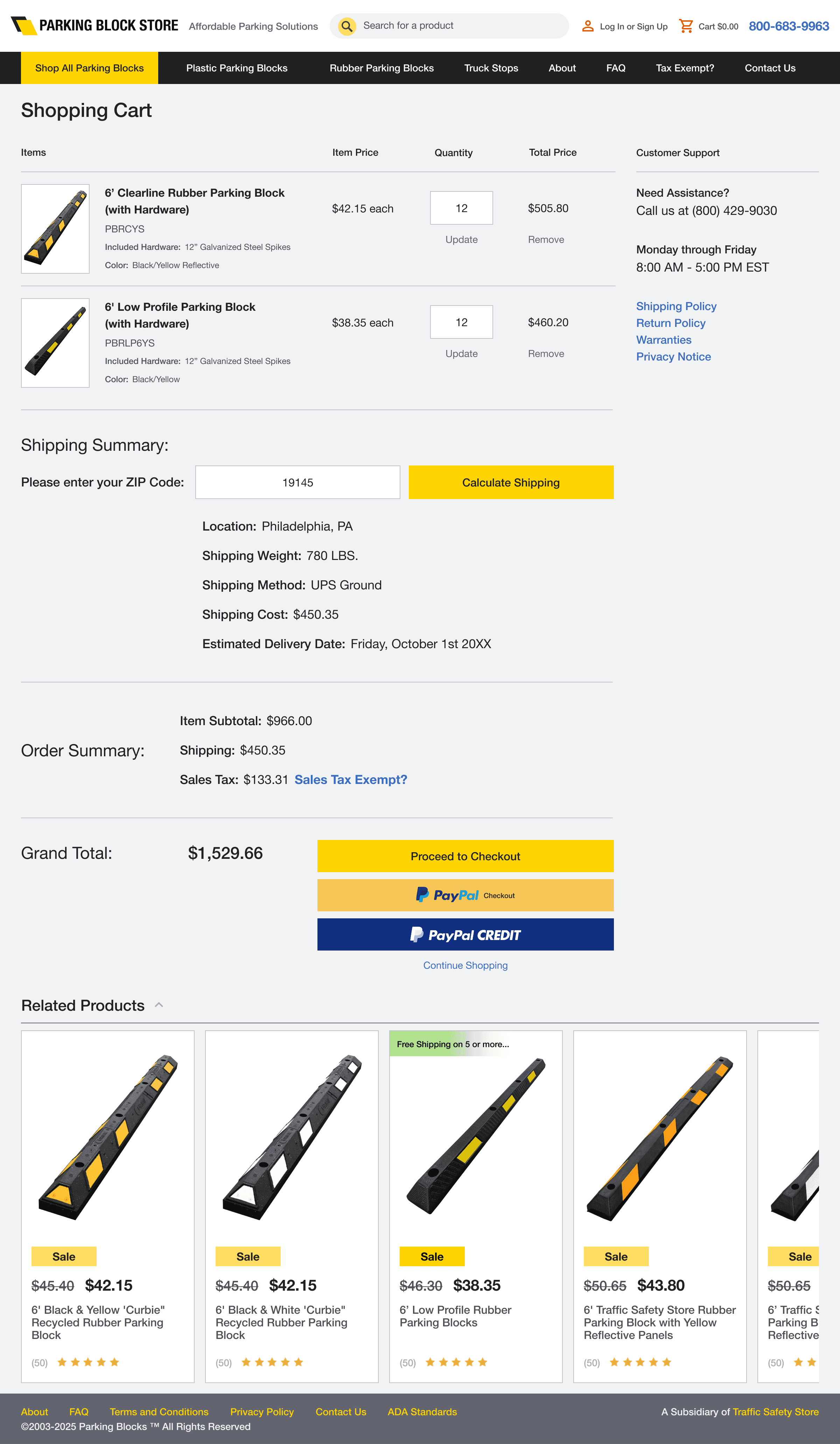
The Design System
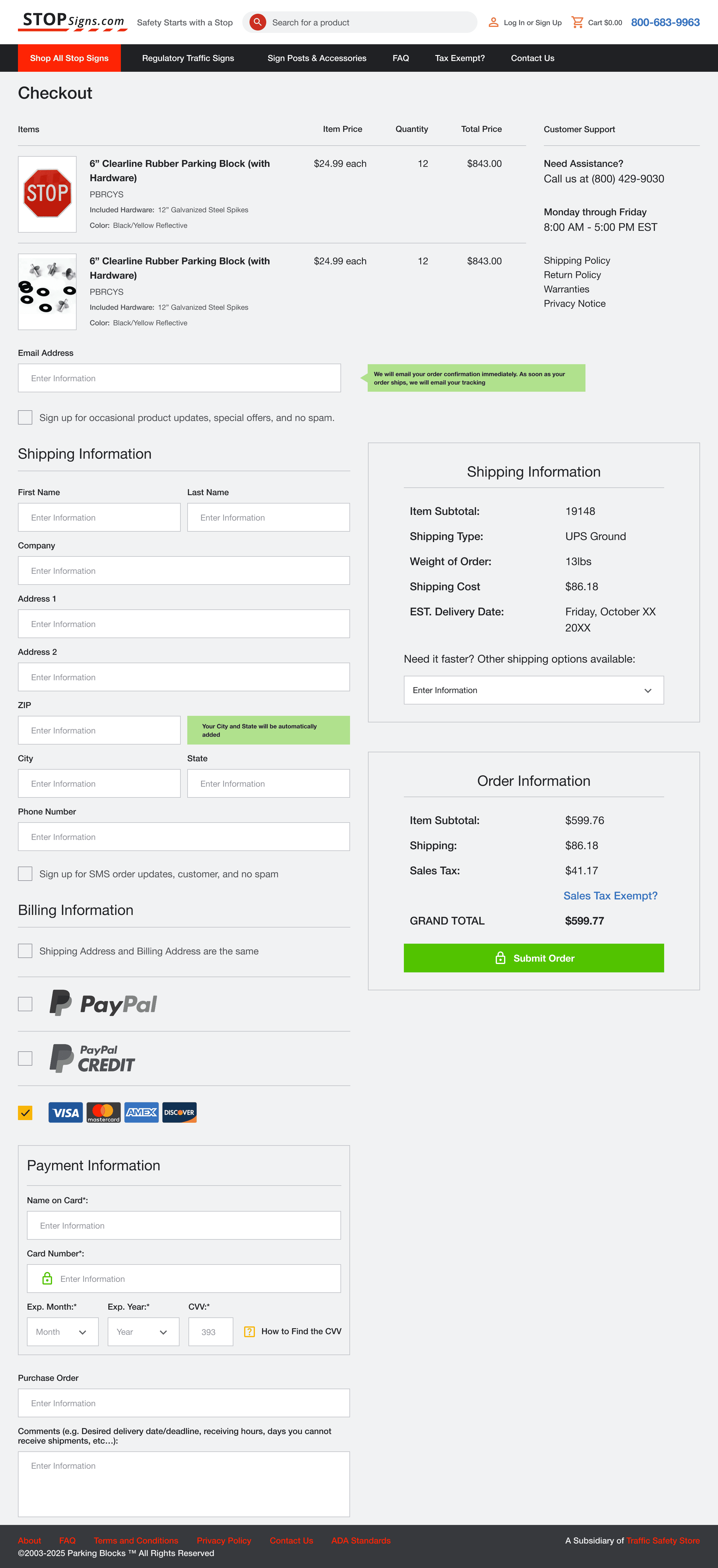
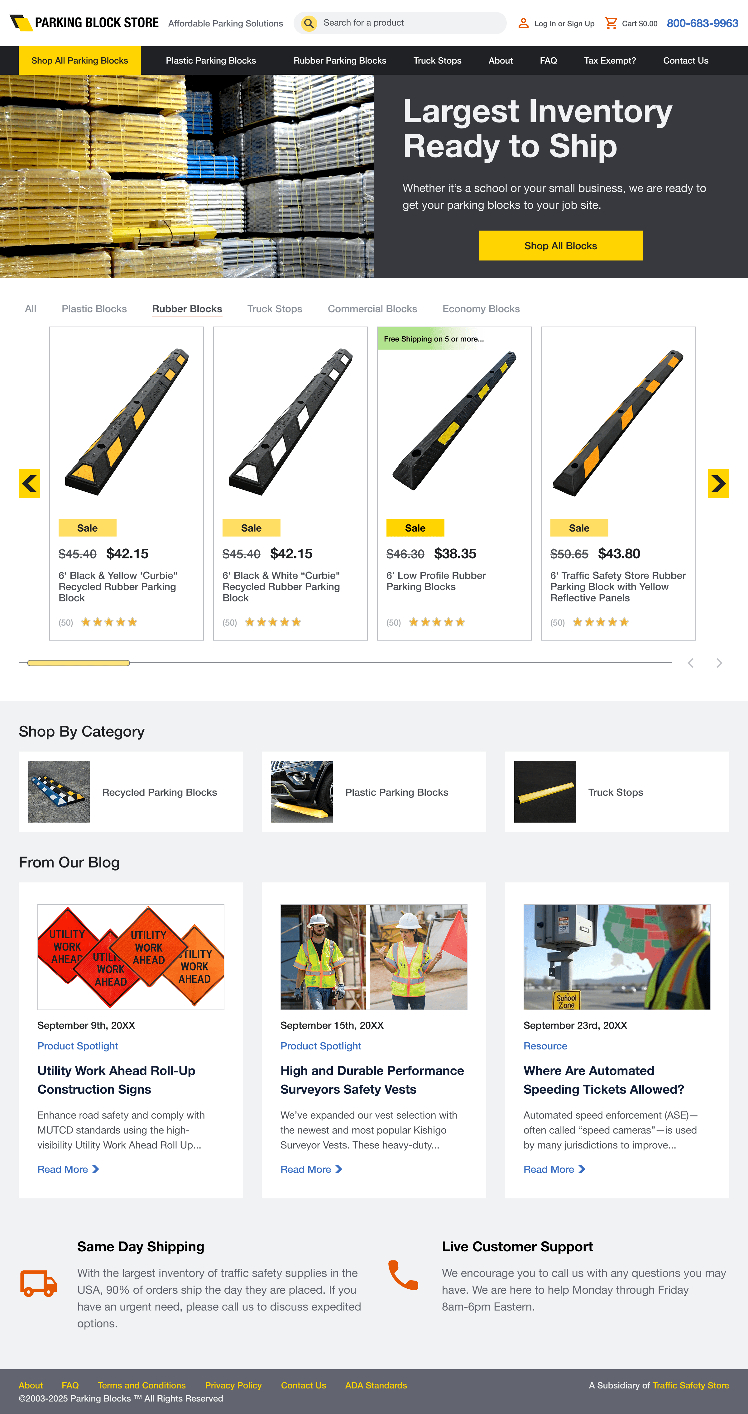
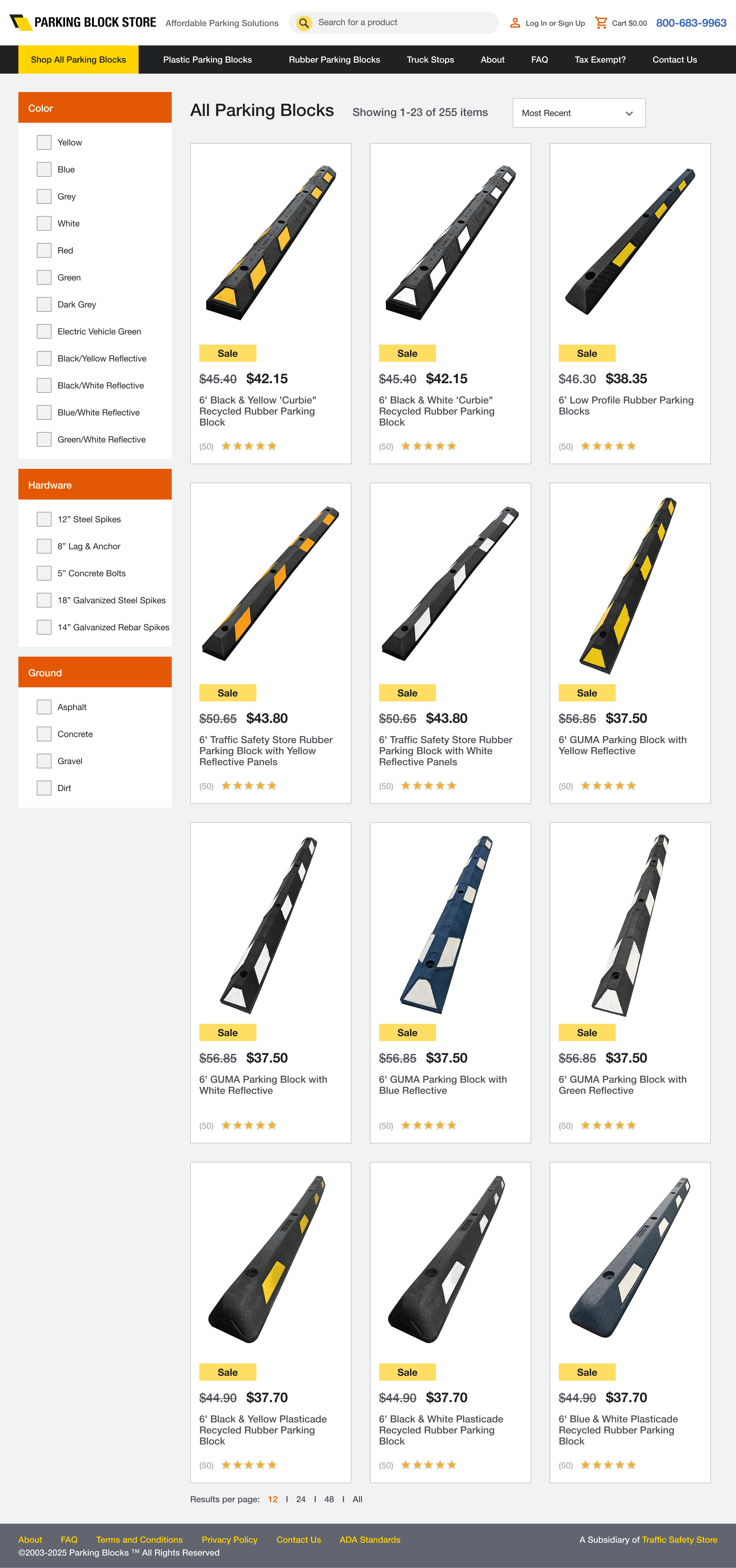
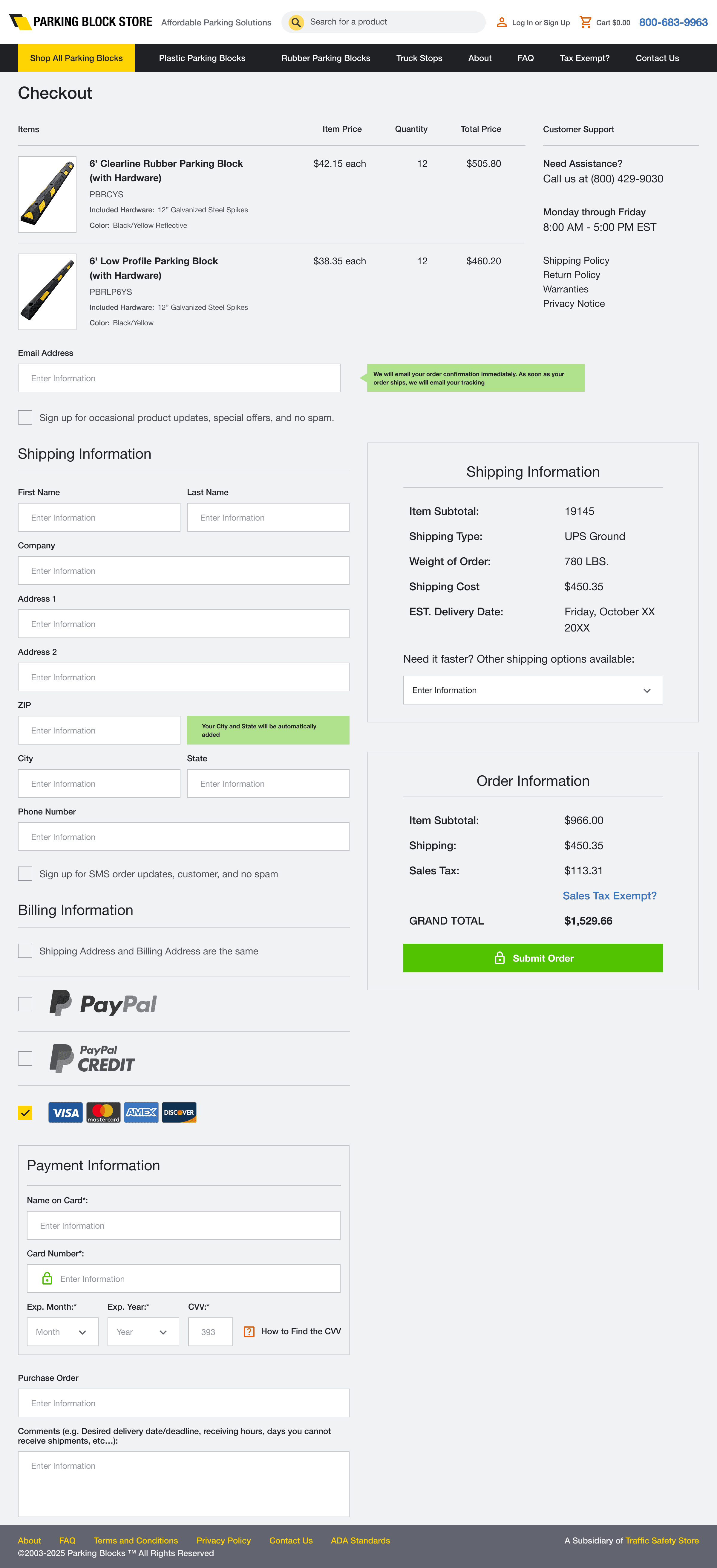
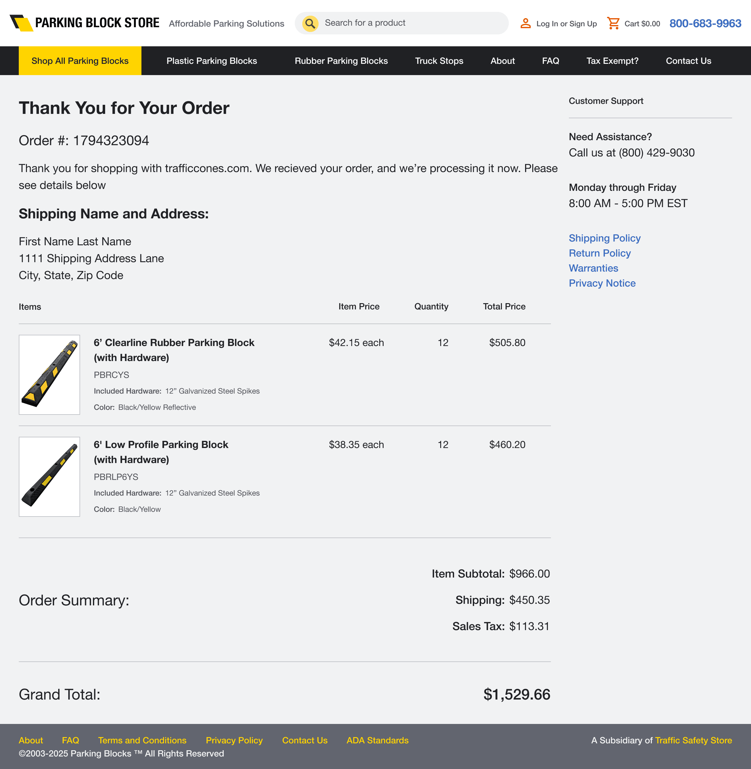
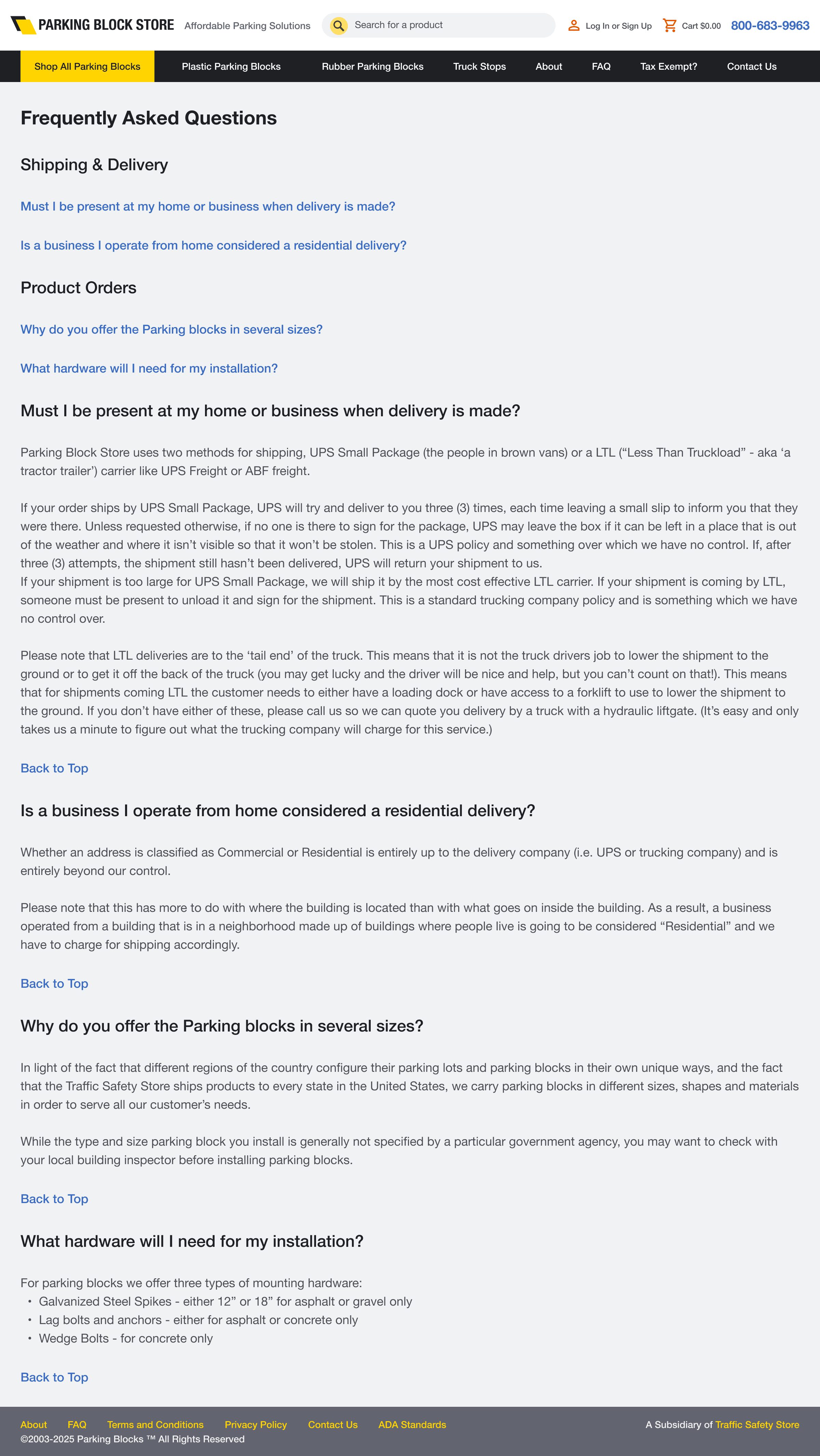
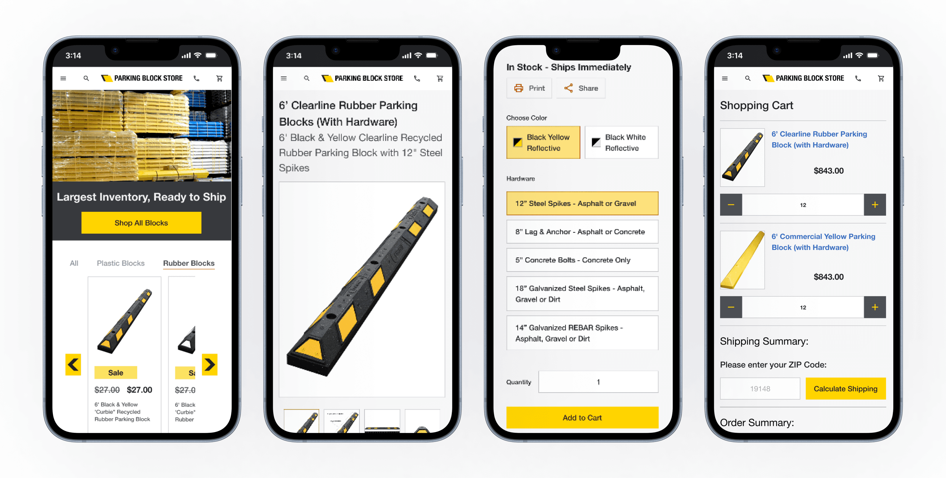
First Up, the Implementation for Parkingblock.com
We decided to test this template with parkingblock.com. We needed it to deliver an intuitive experience for engineers and construction professionals, allowing them to quickly locate and purchase parking-specific products without navigating the vast inventory of the main site.
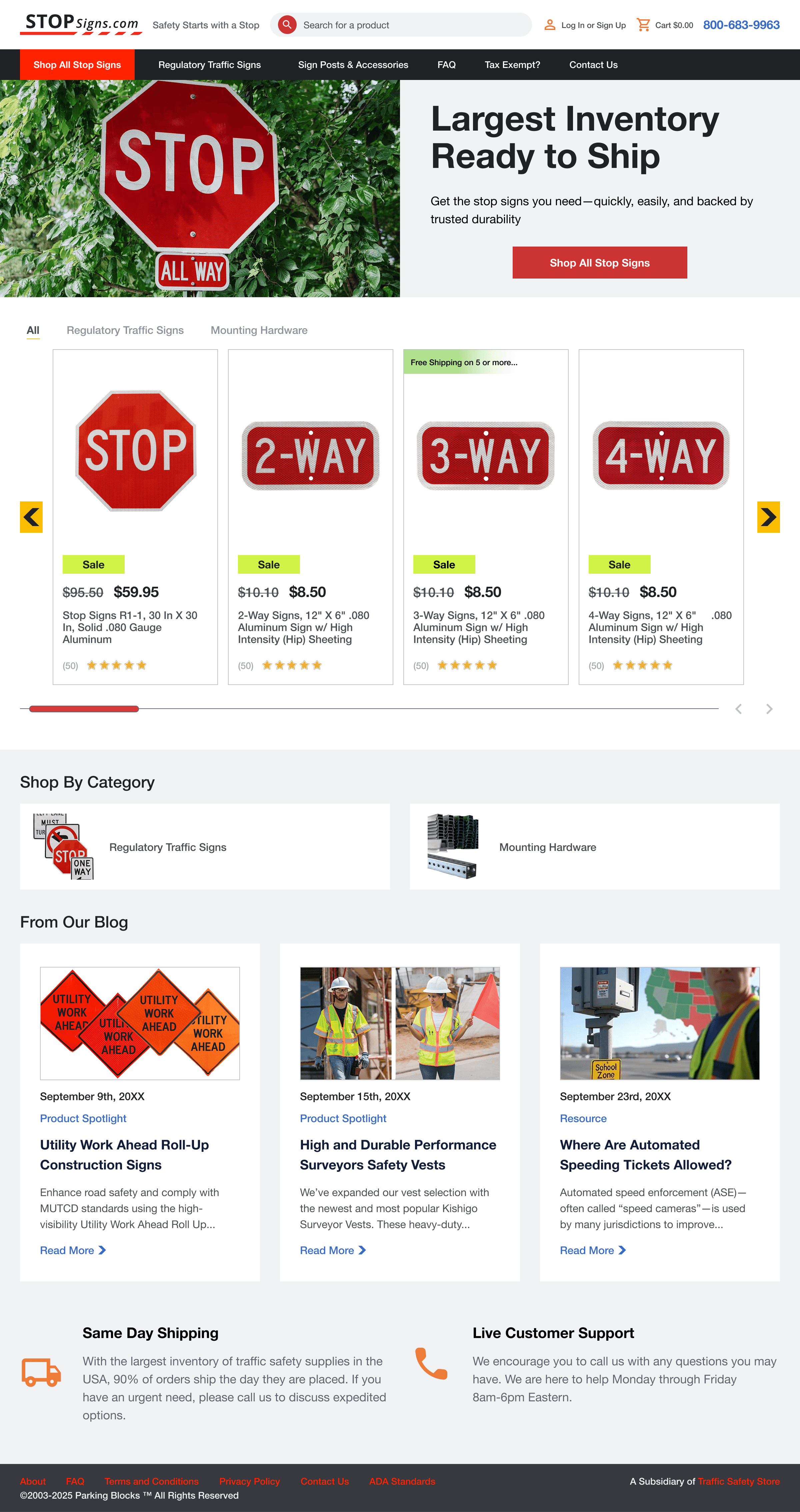
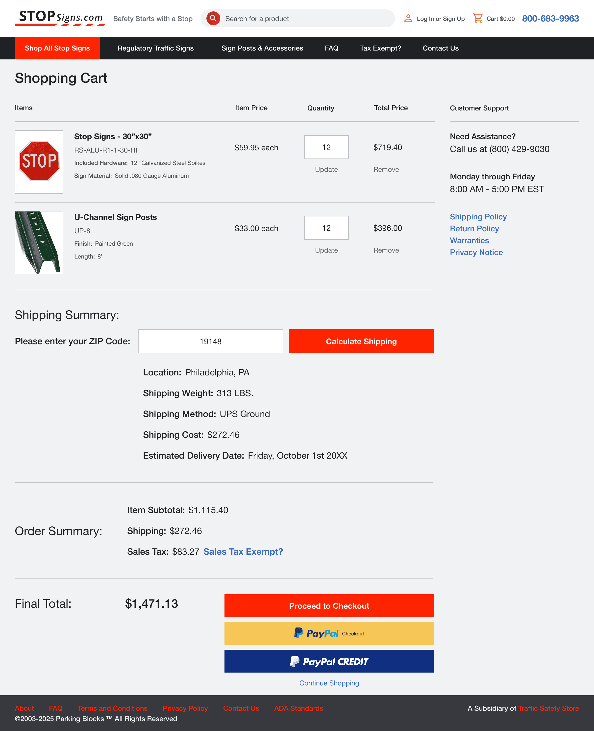
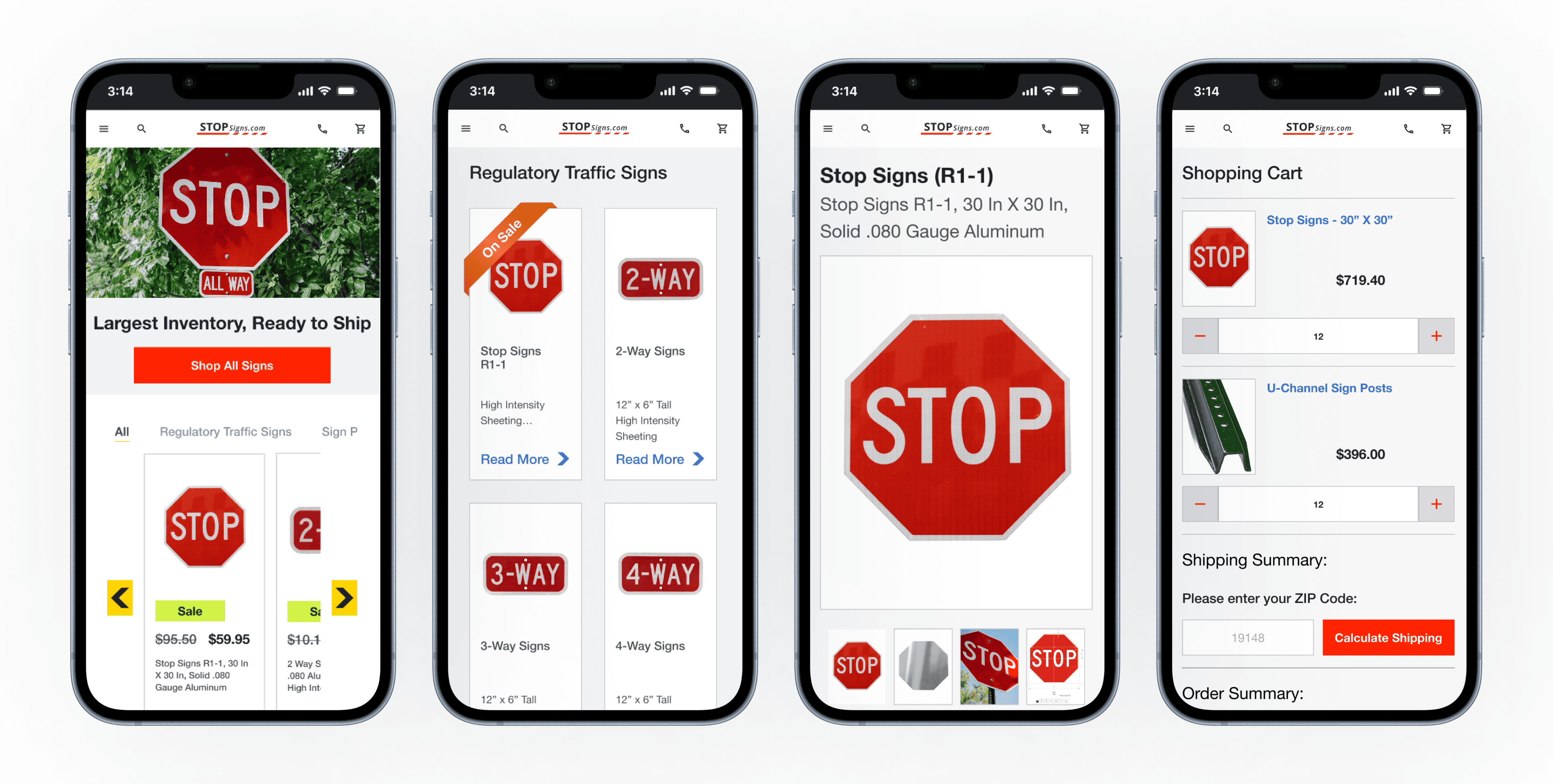
Now, The True Test of the Process, Stopsigns.com
Although I was satisfied with the implementation of parkingblock.com, it was time to see if my time-saving strategy worked.
The marketing team recently purchased the domain name stopsigns.com, and wanted to be the main source for government agencies to get their stop signs. So off to the races we went!
A New Site Design in One Day
Through the design system I created, it was easy to change branding in a single day. The only thing that took a significant amount of time was deciding the products.